Colour is mood in physical form. It nudges how we cook, work, and unwind—especially on large surfaces like cabinets, wardrobes, and wall panels. For 2025, global design fairs signal a clear shift: warm, comforting neutrals meet nature‑inspired greens and a splash of tech‑infused colour. High‑pressure laminates (HPL) from SamratHPL translate these hues into real‑world surfaces that shrug off spills, sunlight, and daily abrasion. Below you’ll find the year’s twelve key shades, curated palettes for different regions, and tactical advice on where each colour shines—no repaint cycles, no guesswork.
1. The “New Neutrals”: Warm, Not Washed‑Out
| Shade | HEX | Mood | Ideal room | Matching accent |
|---|---|---|---|---|
| Soft Oat | #E9DFC9 | Calm, airy | Scandinavian kitchens | Matte‑black fixtures |
| Clay Taupe | #B8A896 | Earthy, grounded | Living rooms | Copper lighting |
| Driftwood Beige | #D5C6B6 | Coastal warmth | Bathrooms | Brushed‑nickel taps |
Why it works
Pandemic‑era interiors leaned into stark whites. Homeowners now want warmth without losing brightness. SamratHPL’s ultra‑matt finish defuses glare, so neutrals feel soft rather than sterile.
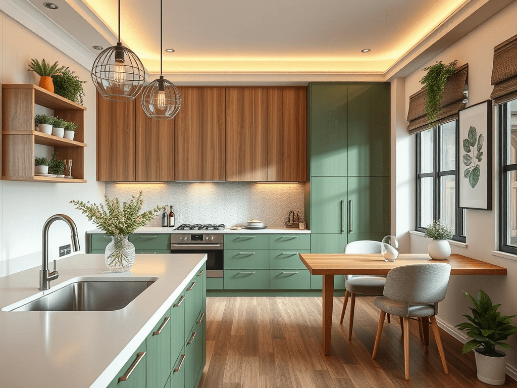
2. Greens That Breathe Life Into Small Spaces
| Shade | HEX | Mood | Ideal room | Matching accent |
|---|---|---|---|---|
| Forest Fern | #4A6A57 | Restorative | Study nooks | Walnut shelves |
| Coastal Sage | #8AA891 | Spa‑calm | Ensuite vanity | Sandstone floor |
| Basil Leaf | #7D835D | Fresh, kitchen‑friendly | Backsplashes | Terracotta pots |
Global tip
Northern Europe pairs these greens with pale woods; tropical markets set them against cool greys to counter high humidity.
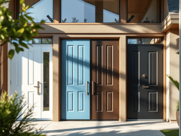
3. Dark & Dramatic: Charcoals and Inky Blues
| Shade | HEX | Mood | Ideal room | Matching accent |
|---|---|---|---|---|
| Graphite Black | #2B2B2B | Urban chic | Media walls | Brushed‑steel pulls |
| Midnight Teal | #16363F | Sophisticated | Master wardrobes | Brass handles |
| Deep Indigo | #1E2847 | Cozy yet bold | Dining bars | Smoked‑glass pendants |
Why laminate over paint?
Dark paints show fingerprints; SamratHPL’s anti‑fingerprint technology keeps deep hues smudge‑free—crucial for high‑touch areas.
4. The Digital Pop: Accent Tones for 2025
| Shade | HEX | Mood | Ideal room | Matching accent |
|---|---|---|---|---|
| Digital Lavender | #B8A0E3 | Futuristic calm | Home offices | Frosted‑white desk |
| Solar Apricot | #FFB36A | Optimistic | Kids’ play corners | Charcoal frame |
| Cyber Lime | #BFEF45 | Energetic | Gaming setups | Matte‑black trim |
Use these sparingly—10 % of a room’s surface or less—to avoid visual fatigue.
5. Region‑Specific Palettes
| Region | Core trio | Note |
|---|---|---|
| Europe (Nordic & Central) | Soft Oat, Forest Fern, Graphite Black | Keep accents matte for daylight bounce. |
| South & Southeast Asia | Driftwood Beige, Basil Leaf, Midnight Teal | Balances humidity and vivid daylight. |
| Middle East & Mediterranean | Clay Taupe, Coastal Sage, Solar Apricot | Complements stone flooring and arched details. |
6. How to Combine Colours Like a Designer
- 60‑30‑10 rule – 60 % dominant, 30 % secondary, 10 % accent.
- Texture harmony – Pair ultra‑matt solids with subtle‑grain wood prints to avoid pattern overload.
- Zone by function – Use calming hues (greens, neutrals) for work and rest zones; reserve accent pops for creative sparks.
7. Cost Snapshot (mid‑2025, installed)
| Finish category | India (₹/sq ft) | Europe (€/m²) |
|---|---|---|
| Ultra‑matt neutral | 240–280 | 95–115 |
| Textured woodgrain | 250–300 | 100–125 |
| Anti‑fingerprint dark | 270–320 | 110–135 |
| Digital accent solid | 230–260 | 90–110 |
Prices include SamratHPL sheet, substrate, adhesive, edge banding, and standard carpentry labour.
8. Maintenance & Longevity
- Cleaning: Microfibre cloth + pH‑neutral cleaner.
- UV stability: ΔE < 2 after 3 500 h Q‑SUN exposure on all featured colours.
- Repair: Minor scratches buff out with a melamine pad; deep gouges refill with matching colour stick.
9. Quick‑Decision Grid
| Goal | Top colour pick |
|---|---|
| Make a small kitchen feel bigger | Soft Oat + Basil Leaf |
| Add drama to a bedroom | Midnight Teal on headboard wall |
| Create a mindful workspace | Forest Fern + Digital Lavender accents |
| Achieve low‑maintenance elegance | Graphite Black anti‑fingerprint |
Final Word
Paint can follow fashion overnight, but large‑surface colours are a longer commitment. Choosing SamratHPL laminates in 2025’s balanced palette of warm neutrals, nature‑inspired greens, confident darks, and strategic digital pops lets you capture the moment without locking you into endless repaint cycles. Mix wisely, install once, and enjoy colours that age as gracefully as the memories they frame—whether those memories unfold beneath Nordic skylights, Indian monsoon clouds, or Mediterranean sunsets.